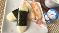


While working on my “DIY Norimaki Senbei (Japan’s Savory Umami Rice Snacks)” article, I noticed something interesting when I lined up five different products:
“The colors they use are almost identical.”
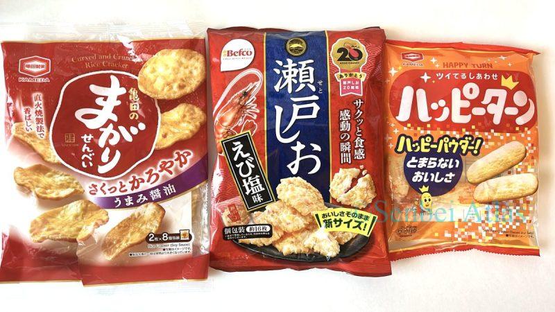
Take a look at the photo below ⬇️
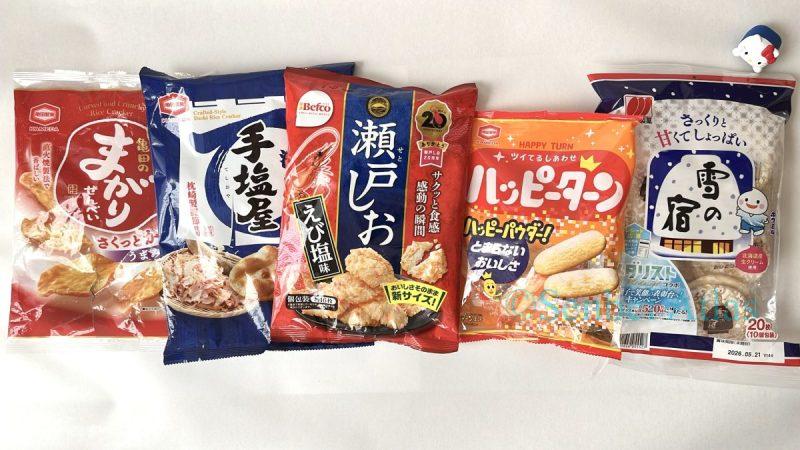
See how much “orange, red,” and “navy” there is?
As a National Cooking License Holder, I’ve always been mindful of food presentation, but I realized these packages hide a calculated strategy—as if the entire bag were a perfectly plated dish.
So, why these specific colors? 🤔 Once you understand the reason, the snack aisle at your grocery store will never look the same again! ✨
🔑 Key Takeaways
- Color Basics & Magic Recipes
Learn the foundation of color pairing 🌈 - Senbei Packaging Strategies
Dig deeper into the use of mouthwatering colors. - Iconic Characters & Color Rules
What are the color secrets hidden in famous Japanese characters!?
The Basics of Color
While building this website, I’ve been studying various design books.
One topic that always comes up as a fundamental principle is “color combinations.”
And that’s where the “Color Wheel” makes its appearance 🌈
(Color is a very deep topic, and if I explained it all, you’ll be nodding off 😪 So this time, I’ll narrow it down and explain it simply. Relax and enjoy the article 🕺)
What is a Color Wheel?
In short, it’s a “Rainbow Ring” that shows you which colors go well together at a glance.

Colors like red, yellow, green, and blue are arranged in a circular gradient. This ring helps you instantly find. Use this ring to find the right color combination.
Three “Magic Patterns” of Color
Here are the three “magic recipes” that form the foundation of design using the color wheel.
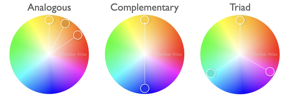
- Next-door colors (Analogous)
Pairs that feel calm and comfortable together. - Opposite colors (Complementary)
“Best partners” that make each other pop and look their best. - The Triangle Balance (Triad)
A set of three colors that form a triangle on the wheel. They create a “vibrant yet balanced” look, forming a perfect team even with different personalities.
Think of it as a “Flavor Map for Your Eyes” to help you find the perfect visual seasoning for your food!
Now, with this in mind, let’s take a look at the colors of senbei packaging 🍘✨
Analysis 1 – Orange and Red
Packages for Magari Senbei (まがりせんべい), Seto Shio (瀬戸しお), and Happy Turn (ハッピーターン) use orange and red as their base colors.
Orange is an “Analogous color” to the golden yellow of the senbei itself 🍘🧡
This minimizes visual clutter and creates a sense of harmony.

Additionally, red used here isn’t just a similar color; it’s strategically placed about 90 degrees away on the color wheel.
This calculated distance maintains the warmth while making the senbei stand out as the main star 🍘❤️
Since orange and red are “Warm colors,” they also help evoke the toasty aroma and cozy atmosphere of rice crackers 🍘🧡❤️
Just as adding a red tomato makes a fried dish look more appetizing, this warm-color strategy recreates a “delicious presentation” across the entire package.
By the way, warm colors are widely used in other food products and manufacturer logos because they stimulate the appetite 😋
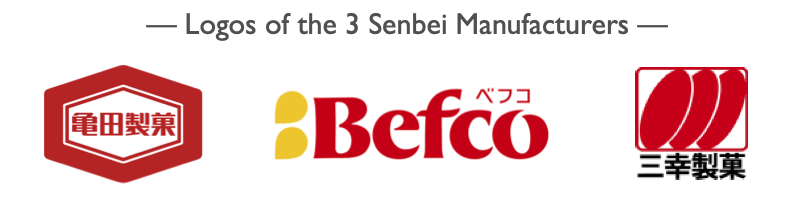
Look at the logos of the three manufacturers we’re covering—they are all “Red”! (Red is also used for logos because of its high visibility.)
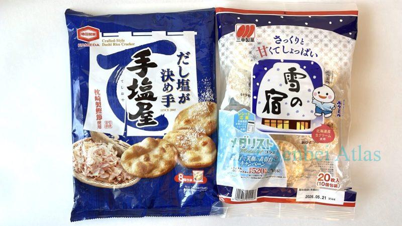
Analysis 2 – Navy and Red
Products like Teshioya (手塩屋) and Yuki no Yado (雪の宿) primarily use navy with a splash of red as an accent.
The relationship between the golden yellow of the senbei and the navy is a textbook example of “complementary colors.”

Combining these two colors enhances the vibrancy of each; the sharp navy makes the soft tones of the rice cracker stand out.
Furthermore, the “cool” tone of the navy evokes the “clean, salty flavor“ of Teshioya and perfectly sets the wintry atmosphere ⛄️ for Yuki no Yado (The Snow Lodge).
Furthermore, in an aisle filled with warm-colored packaging, using the complementary navy is a strategic move to stand out from the crowd 👀
Additionally, the accent red is positioned about 90 degrees away from navy on the color wheel.

This color contrast allows the red to function as a focal point that effectively captures the viewer’s attention 👀
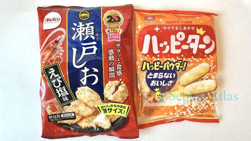
Analysis 3 -Red, Yellow and Navy
In Analysis 1, I identified Seto Shio, and Happy Turn as packages using warm colors for their base. However, a closer look at their accent colors reveals the strategic use of navy and yellow as well.
The combination of red, navy, and yellow forms a balanced “triadic-like” relationship — nearly creating an equilateral triangle on the color wheel.

While not a perfect equilateral triangle, it is close to an isosceles triangle, creating a well-balanced and cohesive color scheme ✨
The reason these three colors don’t clash or blend into one another is thanks to this clever color recipe 🌈
It ensures that specific points stand out as intended while maintaining a cohesive and harmonious overall impression.
Packaging is Filled with a Manufacturer’s Love and Strategy
Now you can see the “Magic of Color” that unconsciously draws us to these senbei!
Manufacturers invest incredible time and effort into creating delicious senbei.
But no matter how good they taste, it’s all for naught if no one picks them up.
That’s why they apply these “best-case” color schemes—to make the packaging as irresistible as the snack inside.
I’ve come to realize that the packaging holds just as much love and strategy as the senbei itself.
…I know that sounds very profound, but to be honest? I only noticed these patterns myself while taking photos for my last article! 💦
Until then, I was just a regular customer, grabbing my favorites and eating them without a second thought.
By analyzing the colors for this post, I was the one most shocked by how calculated these designs truly are. (I might sound calm and analytical here, but I’m actually writing this with a mix of excitement and pure amazement!)
When you realize that every product out there is designed with such precision, it changes the way you look at things, doesn’t it?
Go ahead and take a close look at the snacks in your own home. Do they look a little different to you now?
Extra Trivia: 2 Iconic Characters use the same colors!
It just occurred to me that Hello Kitty and Doraemon share the same color palette: Blue, Red, and Yellow.
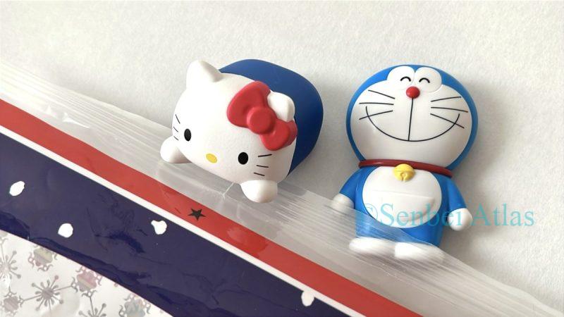
Wait a minute… isn’t this a “triad“?! It’s a “perfect triad“! 😳
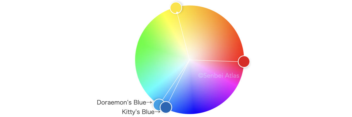
It turns out that even the secret behind the massive popularity of these iconic characters lies in the beauty of their color balance!
—Oh yeah, when I went shopping today, I saw pink and red everywhere. That’s because these are the classic colors for Valentine’s Day 💕
Well, I’ve just reported on the department store’s Valentine’s chocolate event in my latest post. Check it out!❣️
▼ For the intellectually curious: You might also enjoy this deep dive!
* All color wheels in this article created using Adobe Color.
* The Color Theory Guides Used for This Analysis:
・Kaori Mukawa. Shikisai Rule Book. Pie International, 2016.
・Teruko Sakurai. Nihon no Iro. Asahi Shimbun Publications, 2016.